Explore a product direction
Clear sensory squishies
Build the concept around what buyers can see in motion: light, layered color, suspended details, and visual change.

Direction overview
Give the idea one clear reason to exist.
This direction begins with a visual reaction rather than a character story. A reference video, color palette, or description of the movement you want to notice can be enough to start. The conversation then focuses on which effect should remain the hero.
Material reference
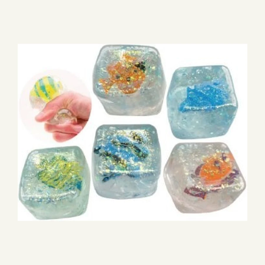
Transparency can lead the whole visual story.
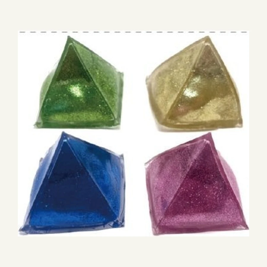
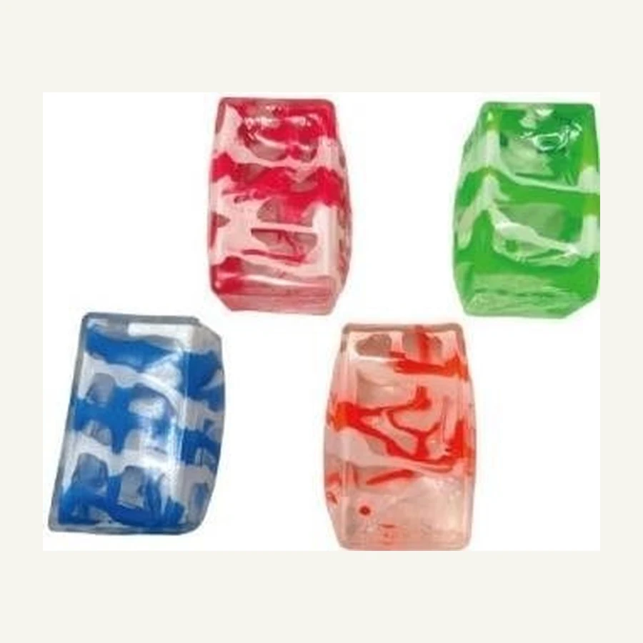
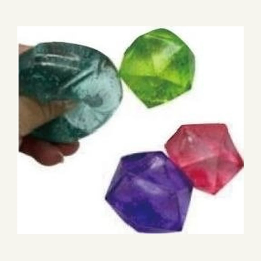
This sample image shows how clear forms, suspended detail, color, and simple presentation can work together. Use it to frame the effect to explore without defining a finished specification.

Make the reference yours
What would you keep, change, or make distinct?
Product + retail packaging
Develop the object and its shelf presentation together.
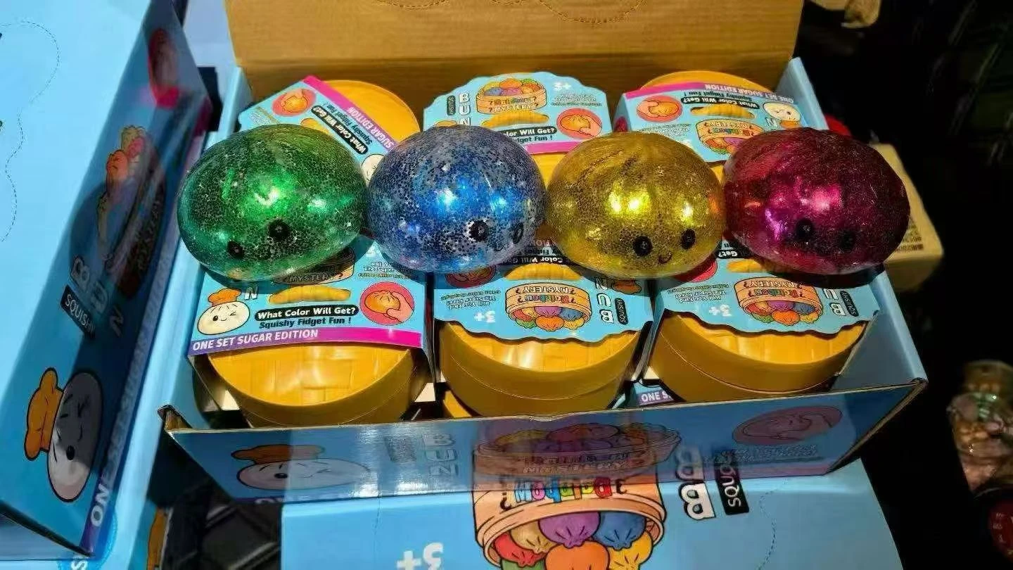
A folding carton, window box, display tray, or label can be discussed alongside the squishy direction so the product and presentation feel intentional.
These are collaboration directions to explore around your brief, not fixed specifications.
Useful starting contexts
Where this direction can begin.
- 01
Sensory-led assortments where movement is part of the visual identity
- 02
Gift concepts designed to catch light and invite closer inspection
- 03
Collection accents that contrast with more solid, character-led forms
Bring one useful clue
Questions that move the first conversation forward.
What should the buyer notice first: color, light, movement, or an inclusion?
Should the overall feeling be bright, calm, playful, or otherworldly?
Does the form stay simple so the internal effect leads the experience?
How should this direction relate to the rest of your assortment?
Keep the first message simple
Have a reference, sketch, or loose idea?
Share what you already have. The message draft will carry this product direction and its source code into the conversation.